

Project Detail
- Client: Harvest International Education, LLC
- Features: WordPress, Responsive, eCommerce, events.
- Category: WordPress
- Project URL: www.hi-edu.org
Project snapshot
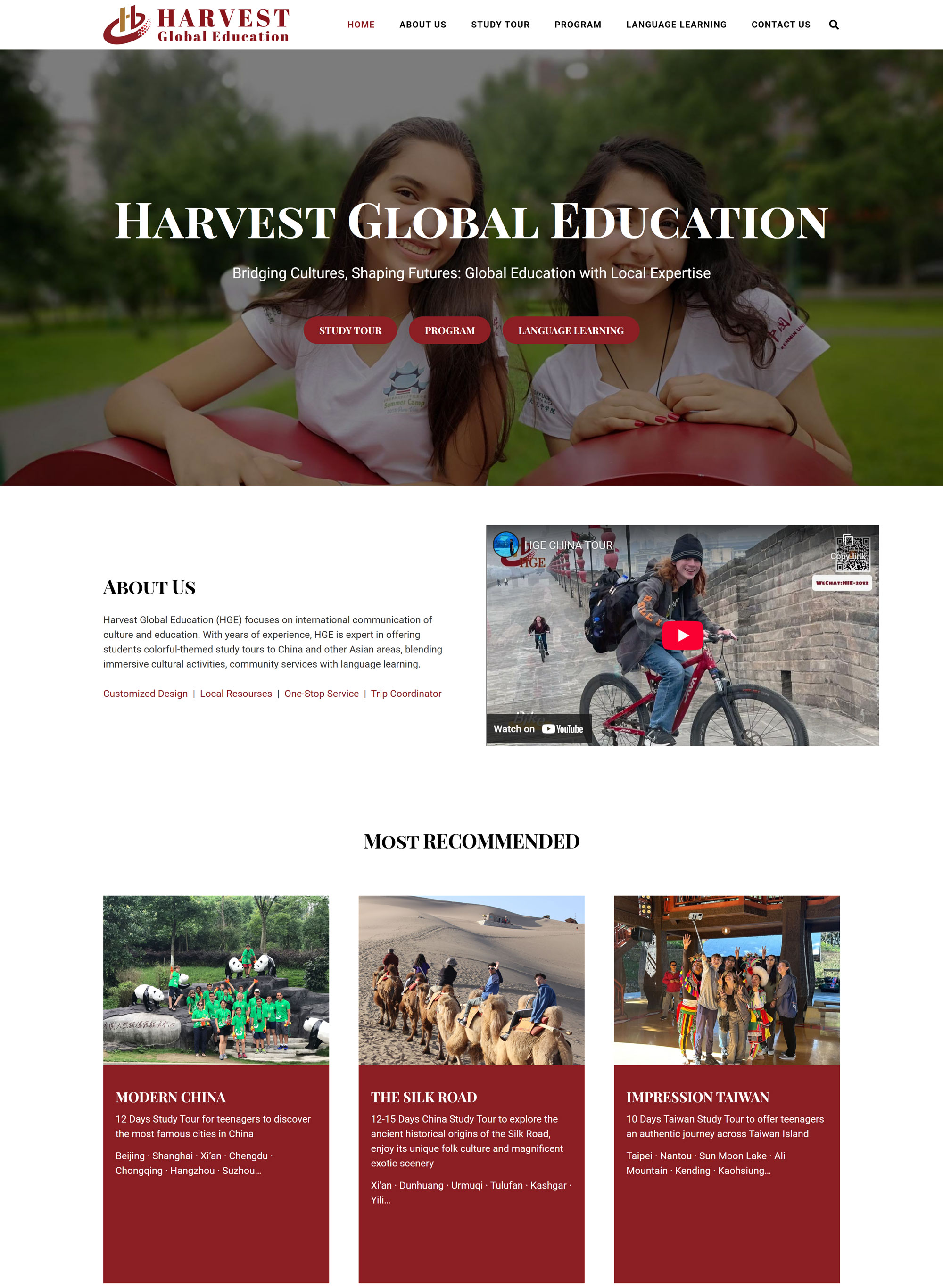
Harvest operates across the U.S. and China, with offices in Boston-area (Burlington, MA) and Beijing, and runs cross-cultural programs including study tours, language learning, and specialized programs for students, teachers, and enterprises.
The site needed to present a wide catalog of offerings—Modern China, Silk Road, Southwest China, Community Service, Taiwan, Hong Kong/Macau, U.S. domestic field trips, plus distinct program tracks—without overwhelming visitors.
The challenge
International education organizations face a classic “complexity vs. clarity” problem:
-
Multiple audiences (students, parents, teachers, enterprises) all landing on the same site.
-
High-trust decision-making (safety, logistics, legitimacy, outcomes) requiring credibility and easy access to “why us” messaging.
-
Program-rich content that must remain scannable, mobile-friendly, and easy to update over time (e.g., highlights/news posts).
Our goal was to translate that complexity into an information architecture and page system that feels simple, confident, and conversion-oriented.
Our approach
1) Information architecture built around how people choose
We structured navigation around the decisions users actually make:
-
About / Why HGE / Highlights for trust and proof
-
Study Tour for itinerary-based browsing
-
Program split cleanly into For Students / For Teachers / For Enterprises
-
Language Learning for ongoing learning pathways
-
A direct, persistent path to Contact
This helps visitors self-select quickly and reduces “where do I click next?” friction—especially important for time-sensitive planning and parent/administrator research.
2) Homepage that acts like a routing layer
The homepage was designed to “route” visitors into the right part of the program catalog, while still conveying the brand’s mission: “Bridging Cultures, Shaping Futures: Global Education with Local Expertise.”
We paired that positioning with direct entry points into key pillars (Study Tour, Program, Language Learning) and reinforced the trust layer with an active “Highlights” section.
3) Program pages designed for clarity, not just inspiration
Program pages were structured to answer operational questions (what you do, what’s included, what makes it different) without losing the emotional “why.” For example, Modern China highlights service features (coordinator teacher, accommodation/transportation standards, visa/air ticket support) alongside cultural exchange and itinerary detail.
That balance matters: decision-makers need both vision and logistics.
4) Conversion: contact without friction
We implemented a contact pathway that’s clear and repeated where it matters—“Ready for your journey with us?” plus a strong CTA—and a contact page that supports both geographies (USA + China) and includes a structured inquiry form with CAPTCHA.
This is a small detail that often drives big outcomes: when a visitor is ready, the site should not make them hunt.
What we delivered
-
A modern, structured education-program website that supports multiple audiences and a large program catalog.
-
Clear program taxonomy (Study Tours, Programs by audience, Language Learning, Highlights) that reduces confusion and increases discoverability.
-
Trust-building About/Why content highlighting cross-border operations and partnerships, plus a system for ongoing updates via Highlights.
-
A conversion-focused contact flow with dual-location contact info and a structured inquiry form.
Outcomes (what this enables)
Because we don’t have permission to publish internal analytics here, we focus on outcomes the build enables—and what similar organizations typically measure post-launch:
-
Higher-quality inquiries (visitors reach the correct program page before contacting)
-
Lower bounce rates on program pages (clear structure + scannable sections)
-
More engagement with “Highlights” as ongoing credibility proof
-
Fewer “basic questions” emails because core logistics and differentiators are easier to find
If you want, I can turn this into a “results section” once you share any of: inquiry volume pre/post, top landing pages, or Search Console improvements.
Why this matters for similar organizations
If you run an education program, study tour company, language school, nonprofit, or training organization, your website has to do three things simultaneously:
-
Establish trust quickly
-
Make complex offerings easy to navigate
-
Convert visitors into qualified inquiries
This project is a clean example of how BBDS Design approaches that: information architecture first, then design, then conversion.
Want a website like this for your program?
If your organization offers multiple programs (or multiple audiences) and your current site feels scattered, we can help you:
-
Rebuild your navigation and program structure
-
Create high-converting program page templates
-
Improve clarity, credibility, and inquiry flow
-
Launch a site your team can maintain without developer bottlenecks